This aesthetic isn’t just for those that want to embrace vibrant hues, it's also for those that want to create a mood-boosting space in their own way.
We break down some of our favourite pinks and shades of Barbieland below
*Images sourced from Pinterest & other sources
The
Wallflower
Pinks
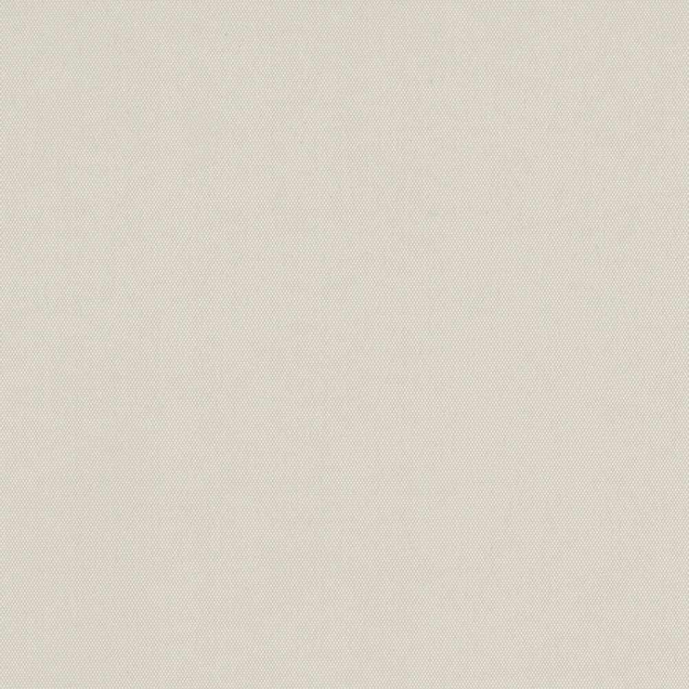
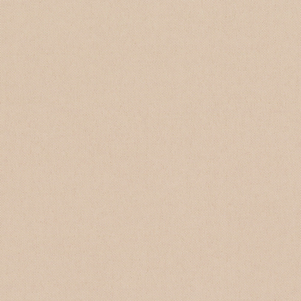
These soft, ‘are they aren’t they’ pinks are great for if one of you wants pink but the other doesn’t, a gorgeous meet in the middle neutral pink that gives a mature feel to a room. Think plaster-like pinks such as Carnival Nougat and Carnival Blackout Dusk or Lick Pink 01 and Farrow and Ball’s Setting Plaster. Their versatility looks good when layered with prints and other earthy tones such as dark browns, green and terracotta; they also serve as a lovely backdrop to rich pops of colour and texture like blue, yellow and velvet.
Fabric featured: Carnival Nougat
"I absolutely love pink. It’s basically a neutral colour. When you walk into the kitchen, yes it’s bright but it still feels really gentle and warm. It just pulls in all the other colours so nicely”.
- Lindsey Isla via Lick
*Images sourced from Pinterest & other sources
Pastel
Pop!
Barbieland has a delectable amount of ice-cream pastels and although soft, these shades are full of personality. Use a few together or pick the one that makes you the most happy and invest in a piece that packs a big design punch. We love the pairing of the amber sofa with lilac, darker colours help ground the dreamy hues while maintaining their sweet playfulness.
“These pink shades are very uplifting and playful, remember Barbiecore is embracing fun, colour and retro vibes in your interior that evoke memories of your love of Barbie but in adult, considered way.”
- Dayna Isom Johnson, Etsy’s trend expert.
*Images sourced from Pinterest & other sources
Pastel
Pop!
Barbieland has a delectable amount of ice-cream pastels and although soft, these shades are full of personality. Use a few together or pick the one that makes you the most happy and invest in a piece that packs a big design punch. We love the pairing of the amber sofa with lilac, darker colours help ground the dreamy hues while maintaining their sweet playfulness.
Fabric featured: Fern Cool Spritz
“These pink shades are very uplifting and playful, remember Barbiecore is embracing fun, colour and retro vibes in your interior that evoke memories of your love of Barbie but in adult, considered way.”
- Dayna Isom Johnson, Etsy’s trend expert.
*Images sourced from Pinterest & other sources
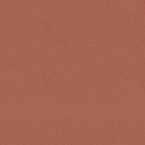
Uplifting
Brights
Barbie is an icon of empowerment and self discovery which the vivid pink has become a symbol of. A captivating hue with unique character and energy, has an uplifting effect within interiors, and we’re not just talking about pink, there are some gorgeous brights with the same feel, so embrace the happiness how you see fit. Pairing with neutrals, warm woods and accents of orange results in a sophisticated but creative feeling space. Full walls may still feel intense for some so consider smaller ways to bring your statement bright in, such as a pink chair or a bright Carnival roller blind. Include fun shapes like Pooky’s curvy wobster lamp and frill edge cushions for that Barbie touch.
“An aesthetic that takes us back to developmental childhood years, a more free time ideal for trying on different looks and personas.”
- Kim Culmone, vice president of Barbie design at Mattel
*Images sourced from Pinterest & other sources
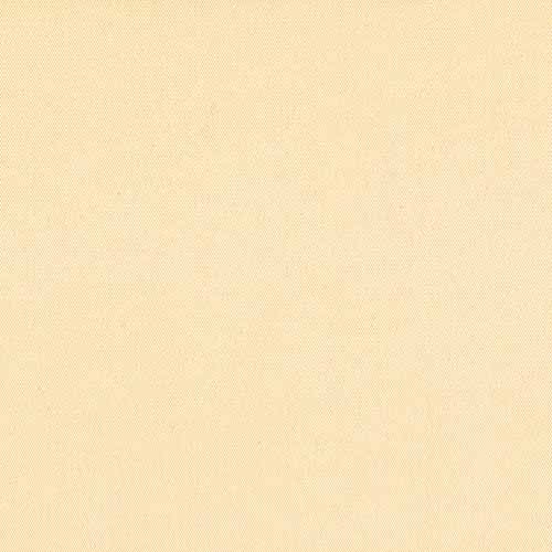
Playful
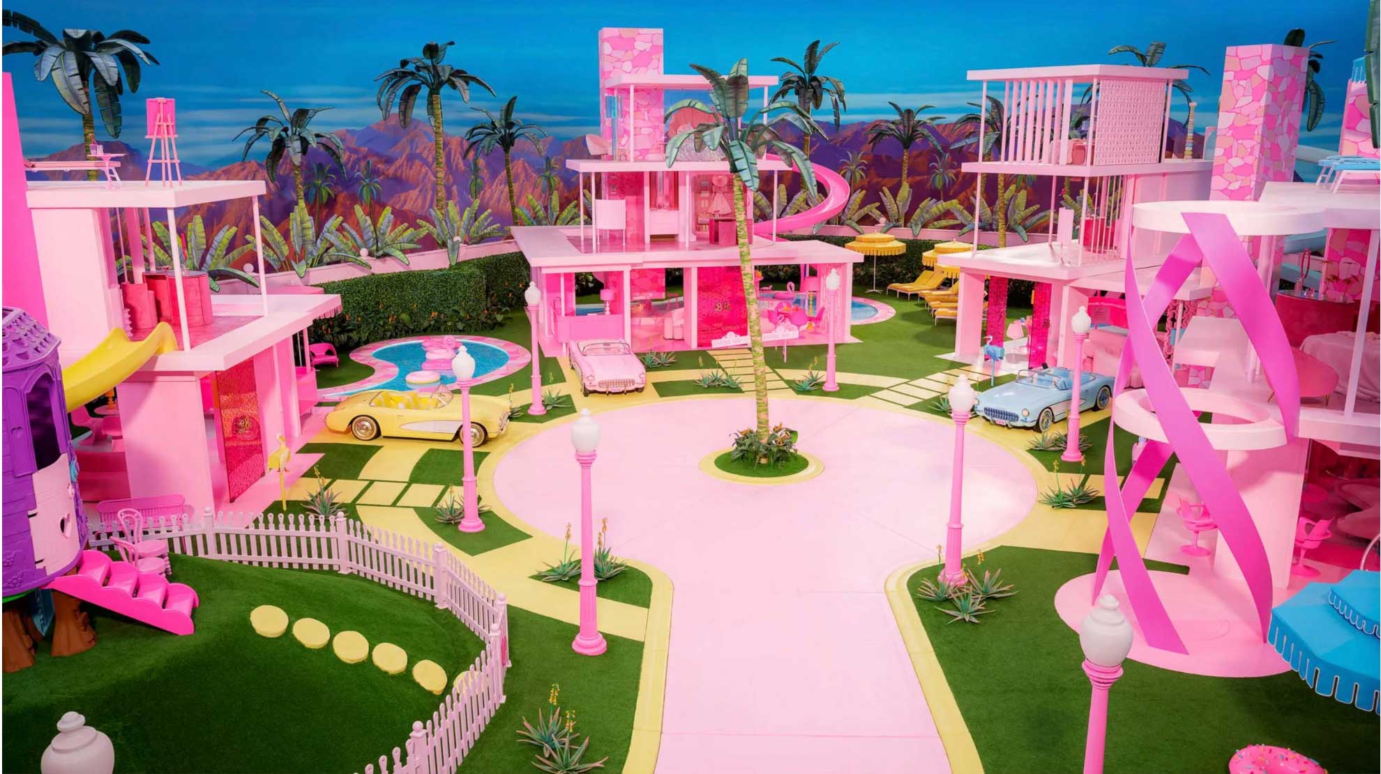
Prints
The set of Gerwig’s Barbie was inspired by Palm Springs midcentury modernism, an era of simple lines, curved focal points and open plan living with connected outside and inside spaces. Translated in Barbie’s world it’s playful, futuristic with retro flare and very pink, when can we move in?? Bring that Palm Spring’s escapism into your home with our pastel hued Fern or curvy Ikat.
“Pinks are no doubt ‘having a moment.' In fact, pink is having more than a moment. The bright pinks and fuchsias we are seeing today are exultant and empowering. They are stand-out statements being worn with confidence”
- Laurie Pressman, vice president of the Pantone Color Institute
*Images sourced from Pinterest & other sources
**Limited stock
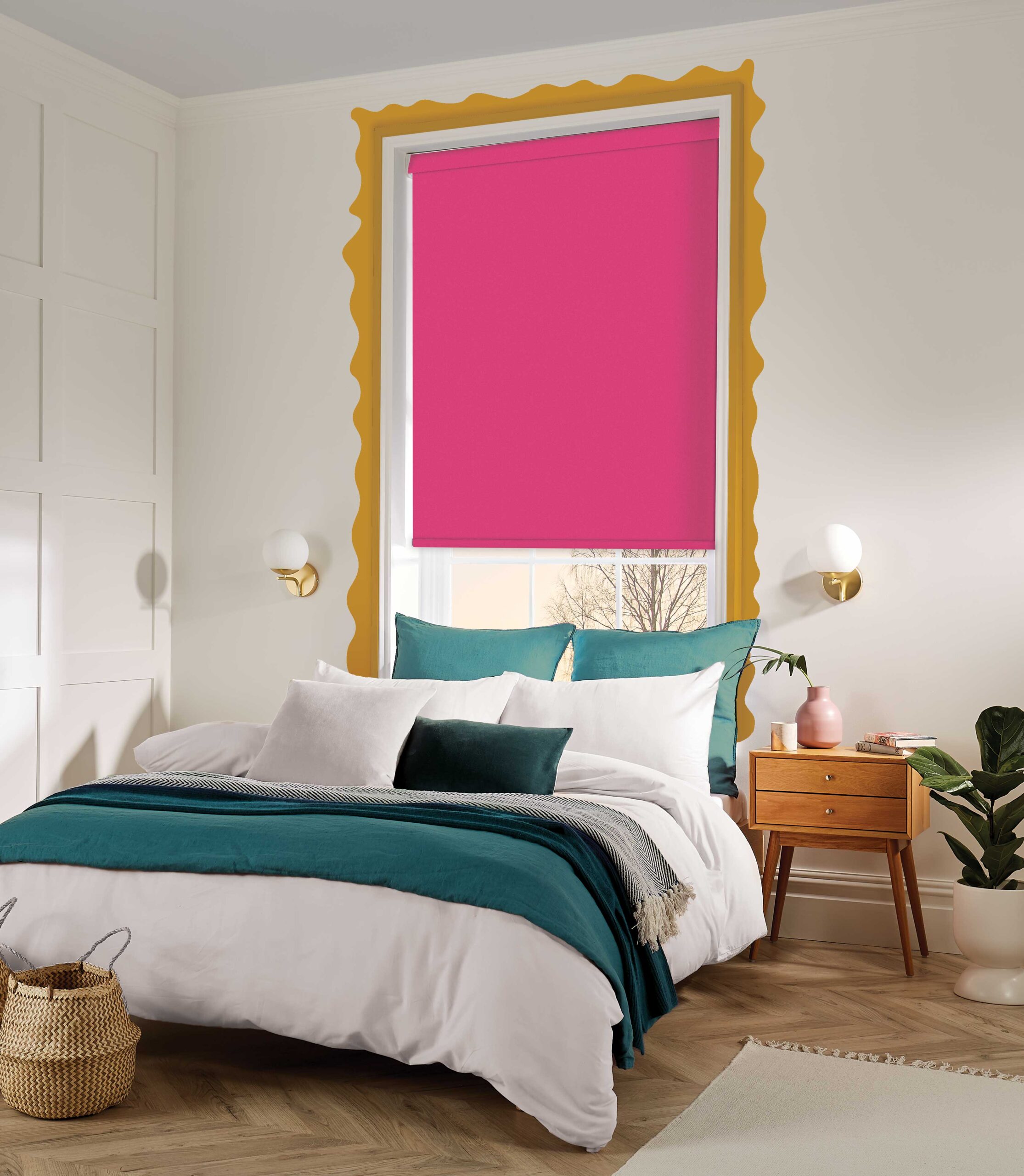
Uplifting
Brights
Barbie is an icon of empowerment and self discovery, which the vivid pink has become a symbol of. A captivating hue with unique character and energy, has an uplifting effect within interiors, and we’re not just talking about pink, there are some gorgeous brights with the same feel, so embrace the happiness how you see fit. Pairing with neutrals, warm woods and accents of orange results in a sophisticated but creative feeling space. Full walls may still feel intense for some so consider smaller ways to bring your statement bright in, such as a pink chair or a bright Carnival roller blind. Include fun shapes like Pooky’s curvy wobster lamp and frill edge cushions for that Barbie touch.
Fabric featured: Carnival Paradise Pink
**Limited stock
Uplifting
Brights
Barbie is an icon of empowerment and self discovery which the vivid pink has become a symbol of. A captivating hue with unique character and energy, has an uplifting effect within interiors, and we’re not just talking about pink, there are some gorgeous brights with the same feel, so embrace the happiness how you see fit. Pairing with neutrals, warm woods and accents of orange results in a sophisticated but creative feeling space. Full walls may still feel intense for some so consider smaller ways to bring your statement bright in, such as a pink chair or a bright Carnival roller blind. Include fun shapes like Pooky’s curvy wobster lamp and frill edge cushions for that Barbie touch.
Fabric featured: Carnival Paradise Pink**
“An aesthetic that takes us back to developmental childhood years, a more free time ideal for trying on different looks and personas.”
- Kim Culmone, vice president of Barbie design at Mattel
*Images sourced from Pinterest & other sources
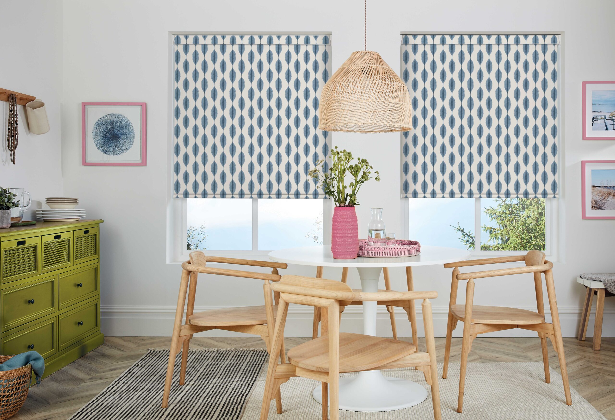
Playful
Prints
The set of Gerwig’s Barbie was inspired by Palm Springs midcentury modernism, an era of simple lines, curved focal points and open plan living with connected outside and inside spaces. Translated in Barbie’s world it’s playful, futuristic with retro flare and very pink, when can we move in?? Bring that Palm Spring’s escapism into your home with our pastel hued Fern or curvy Ikat.
Fabric featured: Ikat Azure
“Pinks are no doubt ‘having a moment.' In fact, pink is having more than a moment. The bright pinks and fuchsias we are seeing today are exultant and empowering. They are stand-out statements being worn with confidence”
- Laurie Pressman, vice president of the Pantone Color Institute
*Images sourced from Pinterest & other sources
The time is now, so don't miss out on the fun!
Get ready to dive headfirst into the unstoppable wave of #Barbiecore, because it's not just a passing trend —it's here to stay!
So unleash your creativity to fashion your ultimate Barbiecore home!
The time is now, so don't miss out on the fun!
Get ready to dive headfirst into the unstoppable wave of #Barbiecore, because it's not just a passing trend —it's here to stay!
So unleash your creativity to fashion your ultimate Barbiecore home!
The time is now, so don't miss out on the fun!
Get ready to dive headfirst into the unstoppable wave of #Barbiecore, because it's not just a passing trend —it's here to stay!
So unleash your creativity to fashion your ultimate Barbiecore home!