Autumn styling is a firm favourite for designers and homeowners alike as it's all down to that get-cosy aesthetic. This season boasts rich amber, jewelled tones, comforting browns and inviting moss greens.
Here are five trending Autumn 2020 colour ideas to get you inspired...
AMBERS & BERRIES
FALL IN LOVE WITH AUTUMN COMFORTS
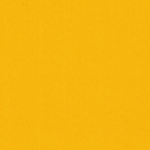
Classic rich tones and down to earth hues really characterise this seasonal palette. With crisp red leaves falling around us and pumpkins appearing on porch steps, it’s natural to want to bring some of those vibrant colours inside. Dried flowers and fresh seasonal fruits such as apples, figs and berries are a great place to start. Coordinate these subtle touches with more striking pieces; a chunky orange throw or pomegranate red cushions will really pull everything together. To make your home even cosier, add an extra layer of insulation with a stunning window blind. We suggest our Wildflower Canary fabric (pictured below) with its warm, zingy shades and gorgeous undertones, your space will feel earthy and subdued but bold and inviting.
~ Pin it!
Check out our Pinterest board for some more interior inspiration.
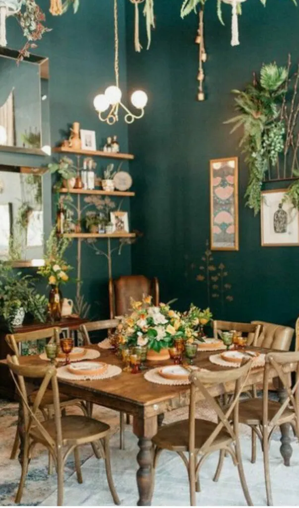
With a movement towards more soothing and deeper shades, teal is a firm favourite heading into the cooler seasons. The combined properties of blue and green makes a teal rich yet balanced. It’s a hue that is calming yet exudes energy, optimism and is uplifting, the exact feeling everyone should have with their home interiors in 2020. Its versatility leaves a tonne of room for creativity; the softer pastel tones contrast beautifully with corals whereas the darker tones pair well with burnt oranges and ambers. When it comes to teal, we believe more is more. Try painting an accent wall, or all of them! – for a dramatic backdrop for you brighter autumnal pieces. And while it’s not a shy colour, using it on larger spaces like walls or window shading doesn’t actually swallow up the space like most fear, but in fact does the opposite, making the space enticing and cosy, creating a cocooning effect.
~ Pin it!
Check out our Pinterest board for some more interior inspiration.
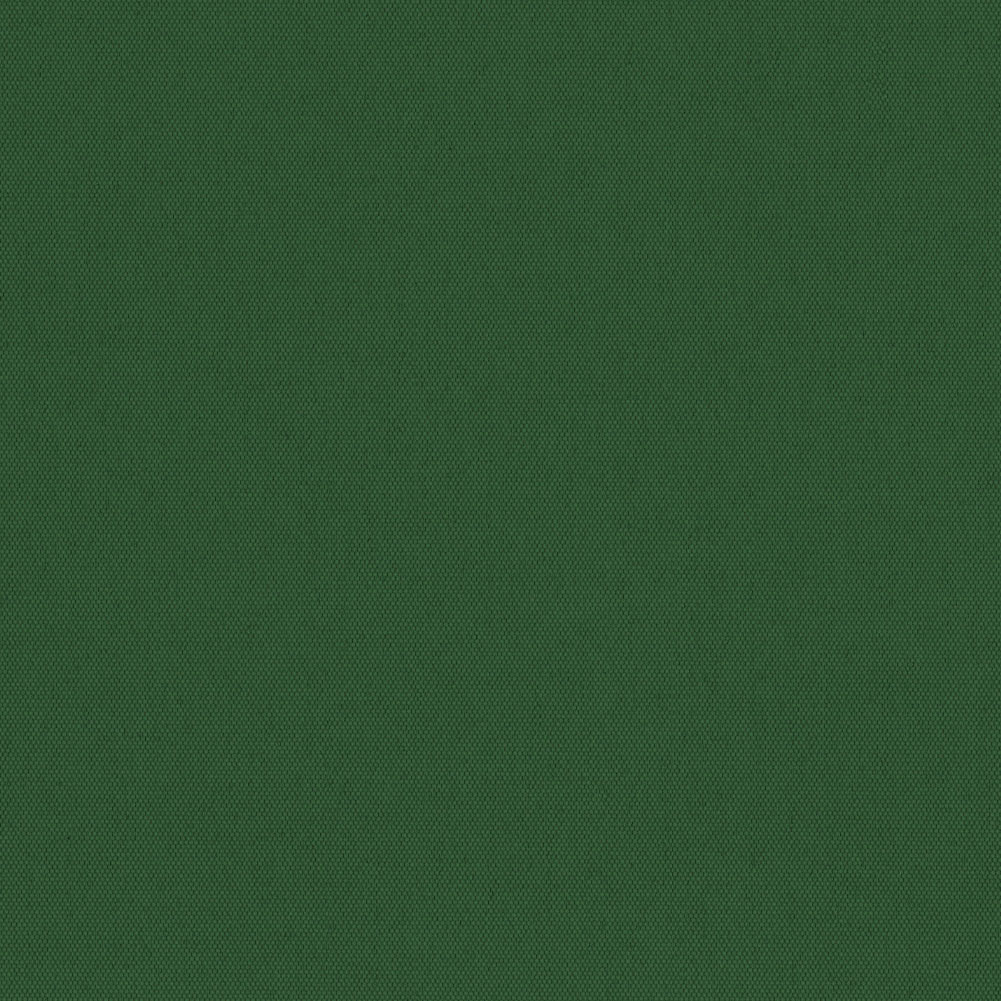
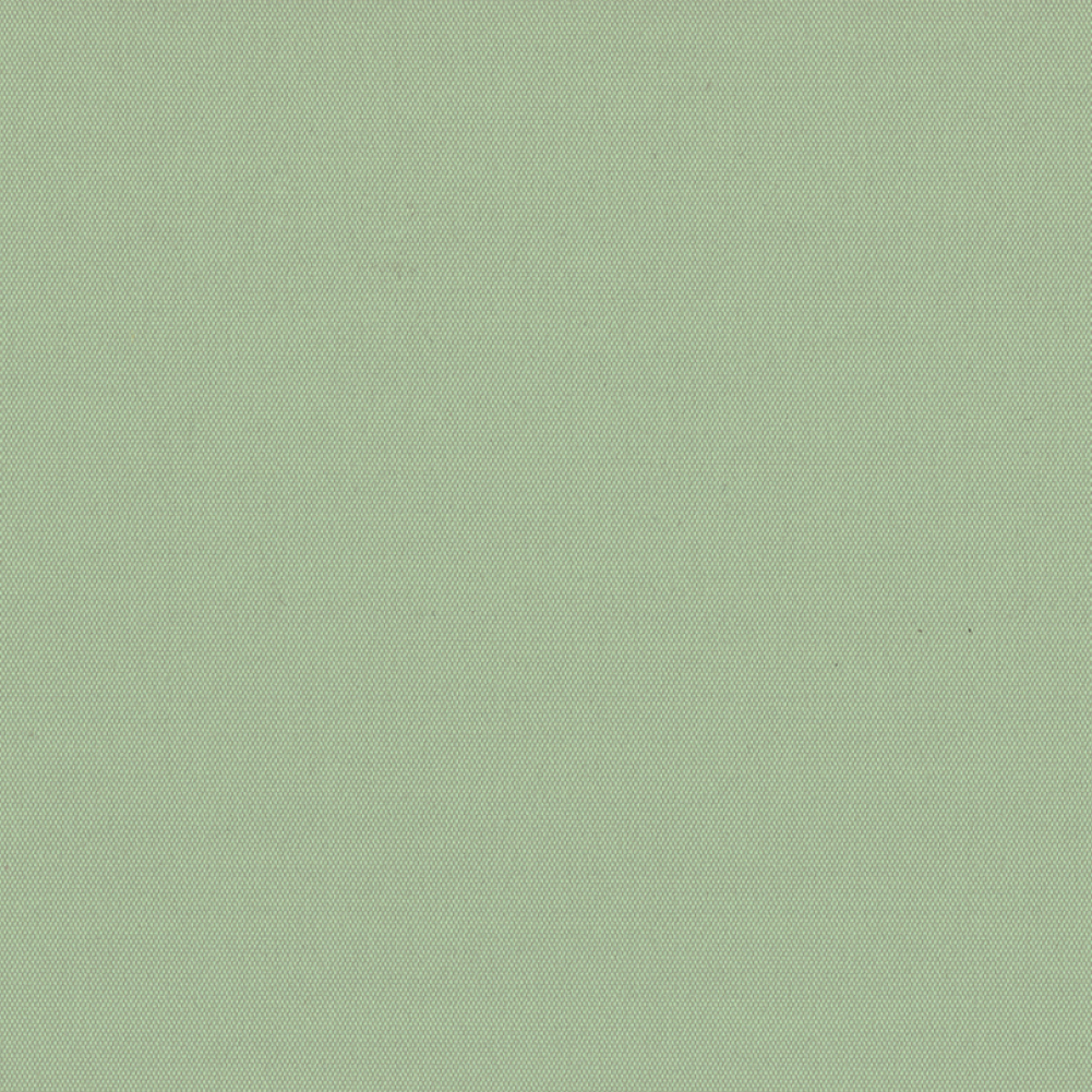
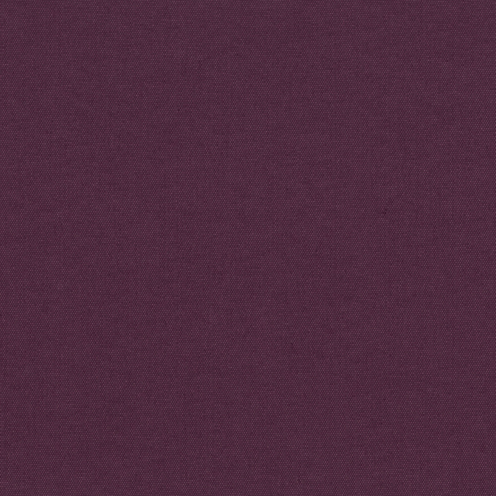
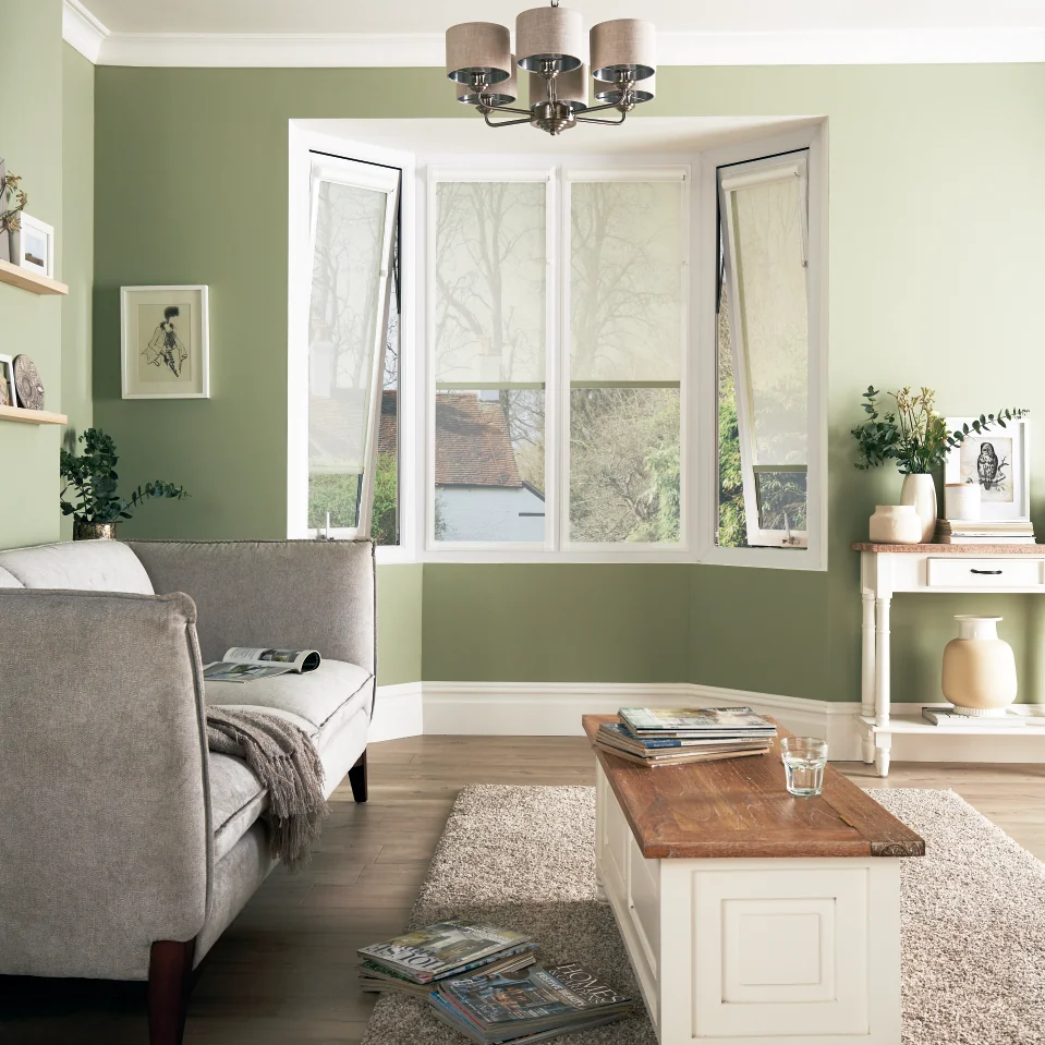
There is the misconception that Autumn celebrates only rich and dark tones, but this certainly isn’t the case. If you’re going for a rustic feel, opt for new greens like soft mints and sage, muted pistachio to earther olive green. Alternatively, if you do prefer the darker tones, venture deep into lush forests, fir greens and rich emerald. Whichever shade you choose you’ll benefit from the balance and harmony it creates in your space, and most importantly, bring you back to nature. Biophilic design incorporates the natural world into your interiors and your chosen shade of green with unify those earthy materials perfectly. Consider terracotta hues tiles for bathrooms or kitchens, accessorise with clay pots and bowls and incorporate warming wood like a substantial table, shelving or counter tops. Offset the green with pops of eggplant purple for vibrancy and sophistication that is incredibly inviting.
~ Pin it!
Check out our Pinterest board for some more interior inspiration.
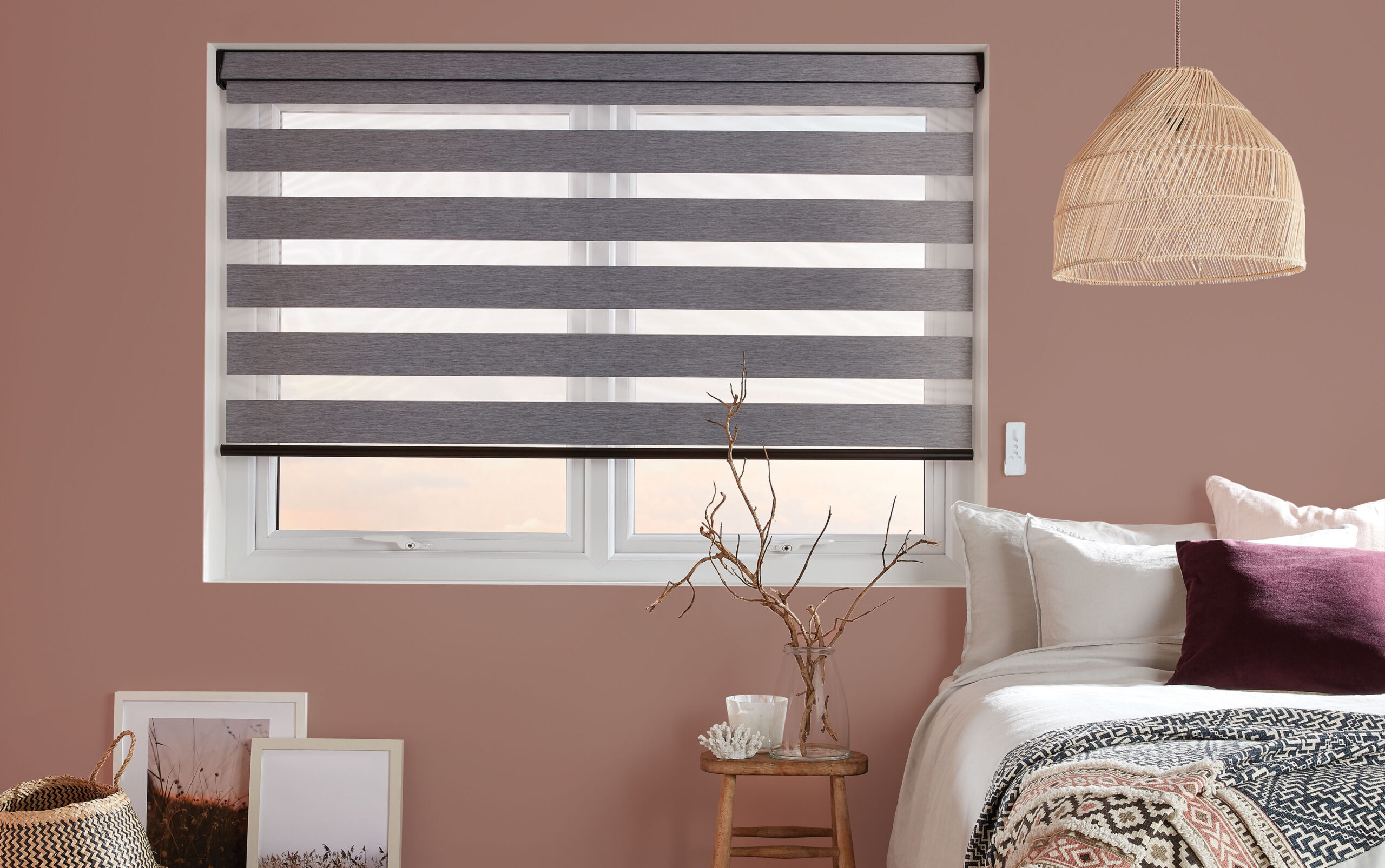
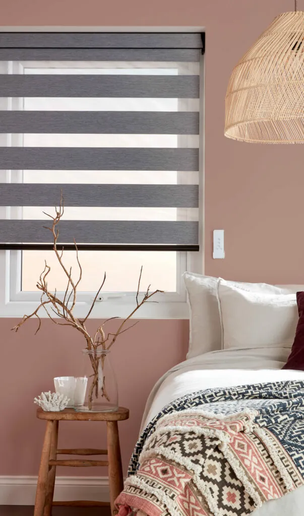
When thinking Autumnal colour, pink is not the first colour that pops into mind but with its tranquil ambience, pinks in chalky and pastel shades are having a moment this season and as the months get colder, pink will continue to be popular in the home. Particularly charming in bedrooms, it brings an immense amount of warmth to a room. Pair with it a contrasting grey, green or deep blue tones or incorporate soft lighting and rich walnut woods for a grown-up interior that’s super inviting. If you fancy something more unpredictable but neutral then incorporate mauve – a colour to watch in 2021 – for a vintage and decadent touch. Melt into the warmth of our Topaz EXP Blush Cellular blinds, pictures below in our Perfect Fit Konnect frames. These frames paired with ESP fabric are the ultimate window shading duo if you want incredible efficient insultation in your room.
~ Pin it!
Check out our Pinterest board for some more interior inspiration.
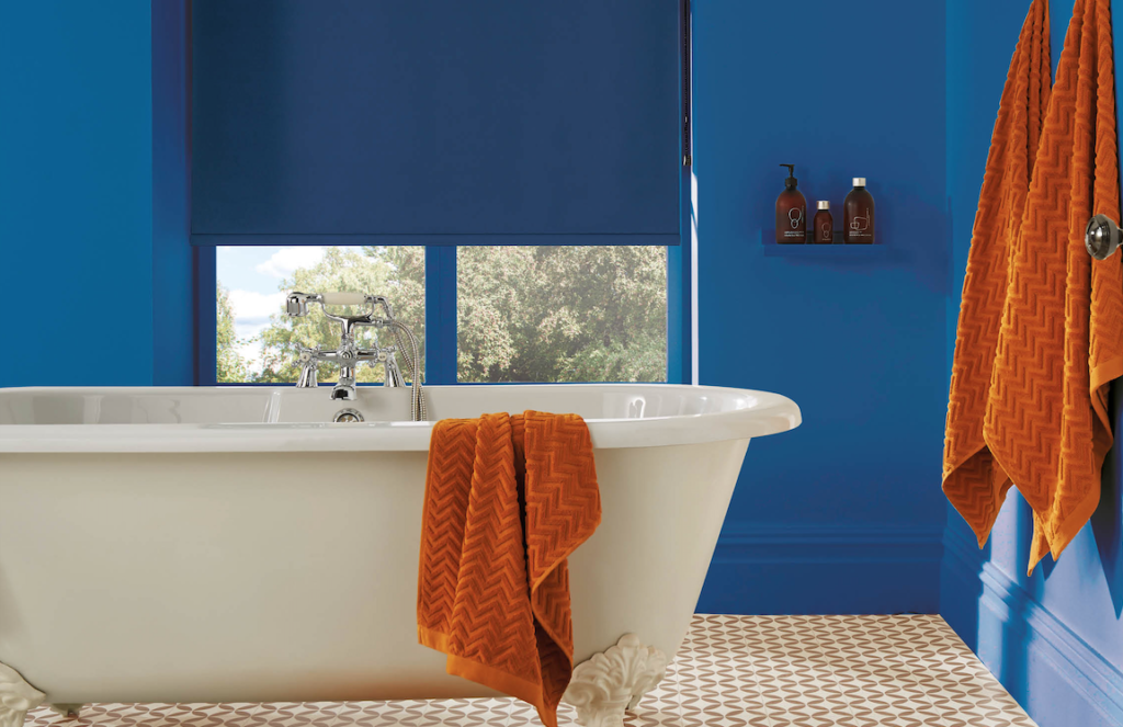
With many having spent months staring at the same decor, a change of season is the perfect time to try something new and maybe a bit bolder. A popular and energy enhancing trend is the coupling of orange and blue. The rich earthiness of burnt orange, rust sienna red and terracotta complement the stark cobalt and classic blue or even go a bit darker. In turn, the pastel hues of these shades are quite dreamy too. Use the blue as your base colour and bring in accents of the vivid orange with velvets, tiles and leather. Embellish with patterns and textiles but keep it grounded with mid-century furniture and natural elements. This trend boasts cosy appeal and we think you’d love it!
~ Pin it!
Check out our Pinterest board for some more interior inspiration.